Mon, Aug 14, 2017
Mobile App Design: Essential Tips for a Better User Experience

Designing a mobile app isn’t just about looks — it’s about delivering an intuitive, efficient, and delightful experience to your users. Whether you’re building an iOS, Android, or cross-platform app, good design directly impacts user satisfaction and retention. In this article, discover 10 essential tips to guide your mobile app design journey — no need to be a designer or developer!
Layout
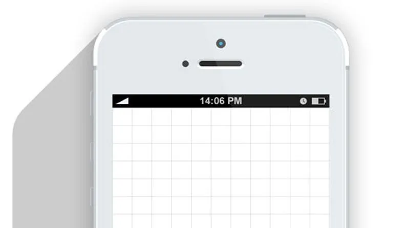
Use grids
A grid is the best way to keep your objects aligned. A tiny alignment problem can completely upset the entirety of your design.
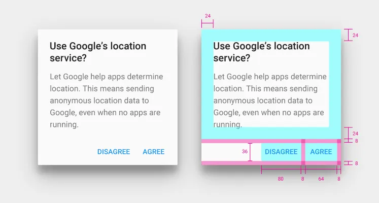
Define margins
From the moment that you place an object, take note of the margins you used and apply the same to other similar elements (for example, each button).
Play with space
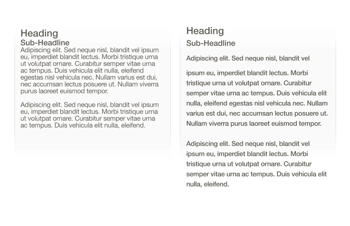
You aren’t creating apps for ants! Even though it’s oftentimes forgotten, putting some air between your elements aids in the visibility and ease of use for your content.
A larger font makes your content more visible and gives your users a better experience. You can also add a bit of space between lines.
Play with contrasts
Increase visibility by accentuating contrasts. The easiest one? Black text on a white background. If you can’t read it easily, that’s a problem.

Colors
Start with black and white
Working in black and white lets you concentrate on the overall experience of using your app and helps you to fix any issues. Color can bring in personal feelings that may prevent you from seeing key elements.
Use color palettes
Mastering color is a true art. Search for “Color palettes” on Dribbble to find existing palettes or you can also use free color generators like Coolors or Color Claim.
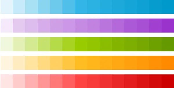
Download the Chrome ColorZilla extension to find the color code of any pixel on any website.
Color that organizes information
Colors can have a real significance. Put more active colors for the most important actions. And pay attention: red, for example, is oftentimes associated with “delete”.
Play with contrasts
Accentuate contrasts to facilitate visibility. The simplest? A black text on a white background. If you have trouble reading, there is a problem.
Fonts
Keep it simple
Did you know that most users can’t tell the difference between Arial, Avenir, Roboto and Helvetica? Save yourself hours of work—once you find a clean font that’s easy to read, use that and move on.
Almost black is more legible than black
Choose #333333 RGB (51,51,51) instead of black for your text. Pure black makes the eye vibrate a bit, making reading more difficult.

Ergonomics
One screen, one task
When you’re starting an app, it’s best to concentrate on one single task per screen (essentially, to have a single “call to action,” such as a button to click).
Your users need to understand where they are: don’t hesitate to add a title to your screens to let them know exactly where they are.
Think with one hand
Screens are bigger and bigger, and most users still only use one hand on them! Keep in mind how your content is laid out in relation to the “thumb zone,” the comfort zone for one’s thumb on various mobile devices.
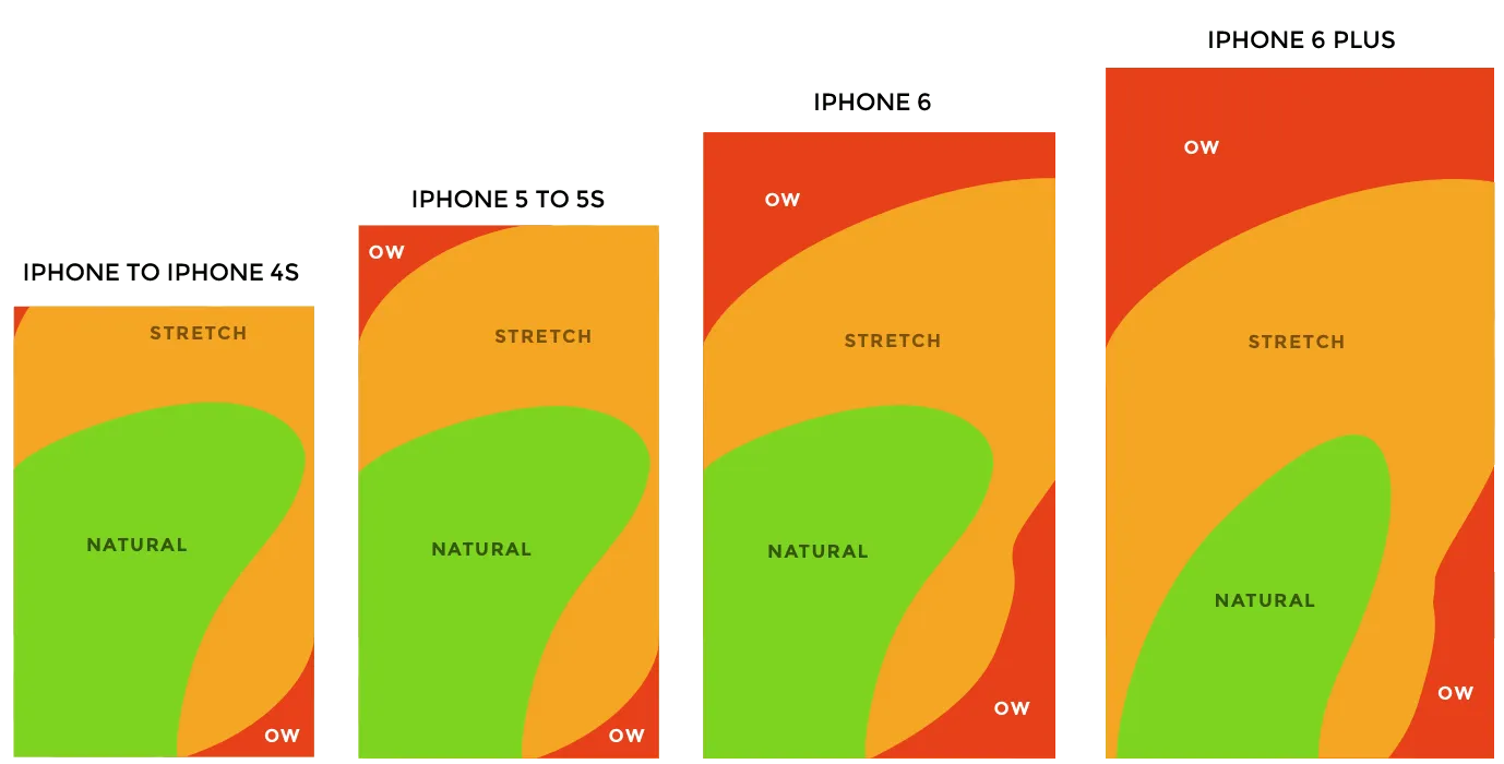
The evolution of the iPhone’s comfort zone by Scott Hurff
Design
Lots of apps are lists
Identify and categorize your screens: are they lists? galleries? a sign-up screen? Once you’ve understood your key categories, find a style and replicate it. Again, your users need to understand where they are.
Check out flat design
It’s today’s mobile design! Flat design is marked by simplicity and legibility. The term “flat” indicates that there’s no sense of relief or depth, as elements are in 2D with a unicolor background, often with vivid colors. You can easily find images and pictures for flat design on the web – a great starting point for beginners.
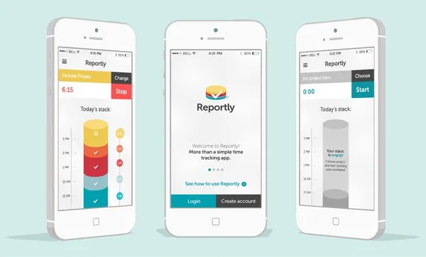
Get inspired by what’s out there!
Good news – the questions that you have already have answers! There are lots of sources online that discuss various types of screens.
Here are a few interesting libraries:
- http://www.pttrns.com
- http://www.mobile-patterns.com
- http://inspired-ui.com
- http://www.lovelyui.com
- http://androidux.com
Look at Apple and Google
Apple and Google both furnish numerous resources for designers and developers, letting them best create apps for their operating systems.
iOS Human Interface Guidelines
Conclusion
When you’re making an app, keep it simple and intuitive! Your users don’t have time to waste on understanding anything complicated, they’ll just move on to the next app! And before you get started on a complex app, form that solid center: you’ll always be able to enrich it further as time goes on.
To read a bit more:
