Tue, Mar 15, 2022
Essential UI Design Elements for Your App Project
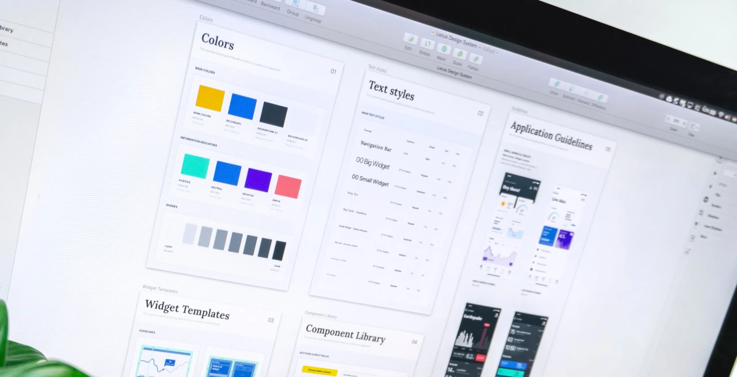
User interface (UI) elements are the blocks that are composing apps or websites. They add interactivity to a user interface, providing touch points for the users as they navigate their way around: buttons, app bar, menu items, error messages and checkboxes.
When creating your app, you need UI elements to create a visual language and ensure consistency across your product—making it user-friendly and easy to navigate without too much thought when users interact. This is how you will create a better application.
Here are the main UI elements you should know about. This list is not exhaustive but you’ll find great ideas and inspiration for your next app project.
There are lots of UI kits available online for download. A UI kit is a set of files that contains critical UI components like fonts, layered design files, icons, and design components. There are several formats depending on the software you use for prototyping (Adobe XD, Sketch, Illustrator, Figma…).
Apple and Google provide UI resources for designing great apps that integrate seamlessly with their platforms:
iOS Human Interface Guidelines
User input
Checkbox
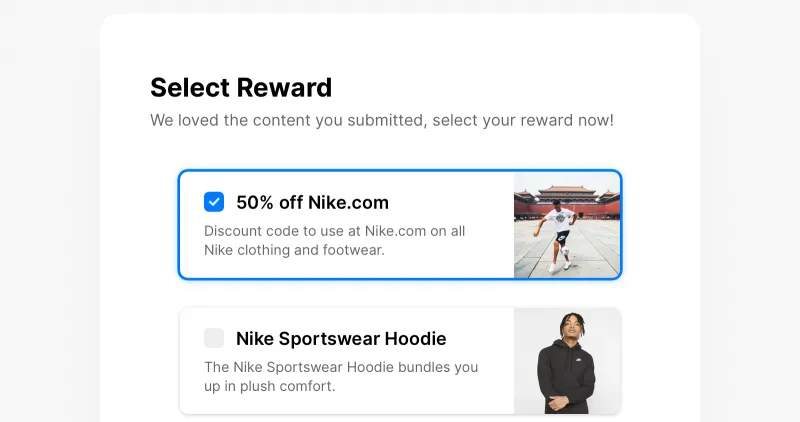
A checkbox allows users to select one or multiple options from a list.
Radio buttons
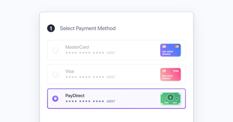
Radio buttons allow the user to select one option from a set.
Toggle / Switch
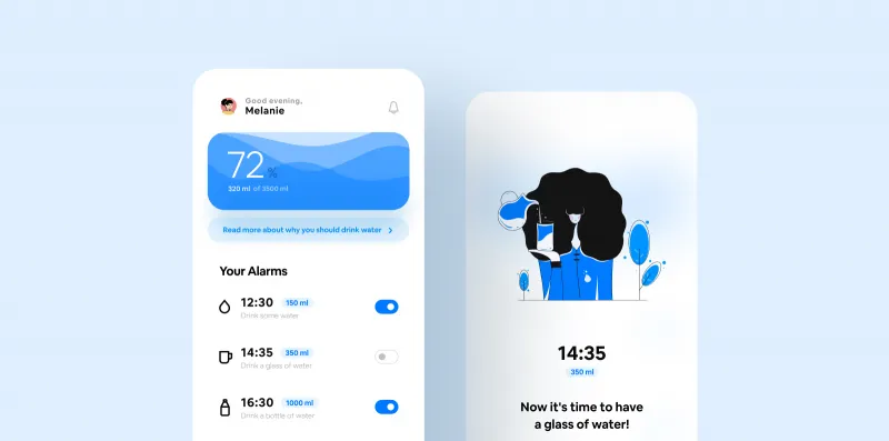
These are for binary options. It toggles the state of a single item on or off.
Text fields
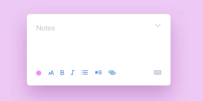
Text fields let users enter and edit text. It can be one single or multiple lines.
Buttons
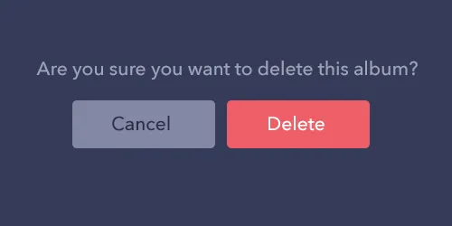
Buttons allow users to take actions, and make choices, with a single tap. They usually are displayed as shapes with a label.
Drop-down list
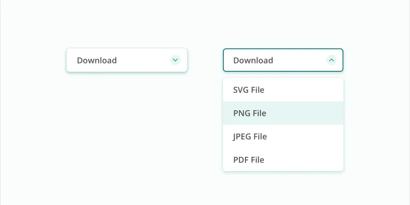
It allows users to select an item from a list that “drops down” once we click on it.
Forms
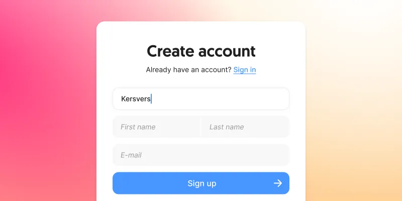
Forms help users input sets of related data into the system and submit them.
Search bar
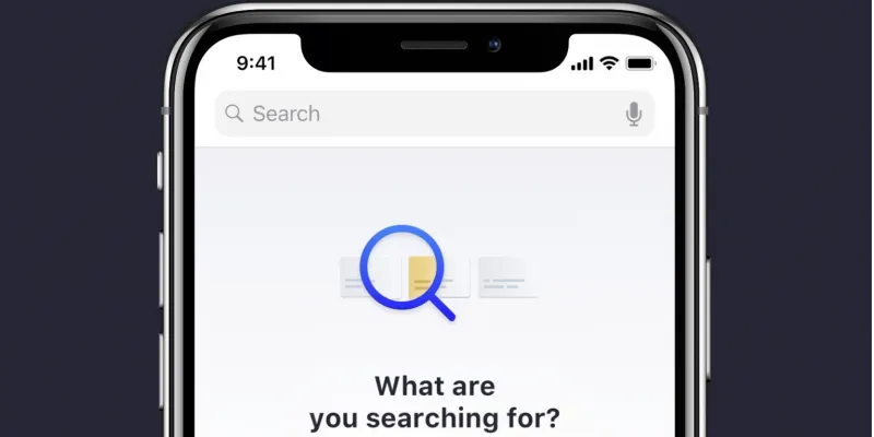
Search bar are specific input fields to search or filter items.
Utils
Toast
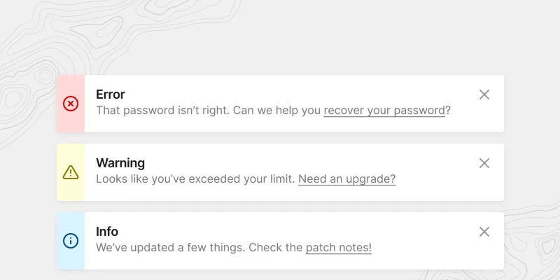
Toast displays a notification over the top of an app’s content. User can dismiss it by tapping anywhere outside of it.
Modal/Pop-up

A small box containing content that requires you to interact with it before you can close it and return to your flow.
Popover
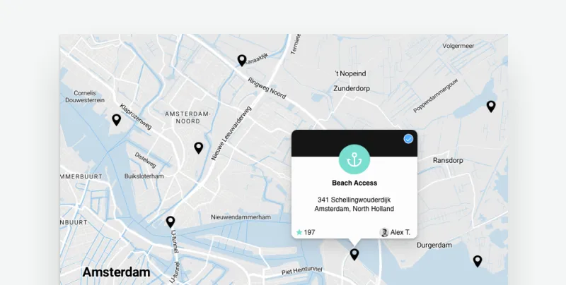
A popover can be used to display some content on top of another.
Loaders
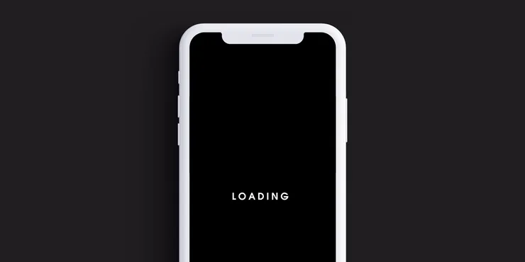
Loaders are designed to let users know the system is completing an action in the background and should wait.
Content
Accordion

Accordions let users expand and collapse sections of content.
Carousel
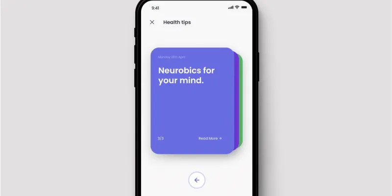
Carousels allow users to browse through sets of content, like images or cards, often linked to more content or sources.
Pagination

Often at the bottom of a page, pagination organizes content into pages.
Slider

Sliders allow users to make selections from a range of values.
Digital Portfolio

Add a digital portfolio to showcase your work.
List
Grid list
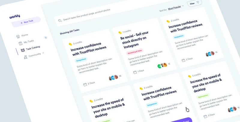
Grid lists display a collection of images in an organized grid.
List
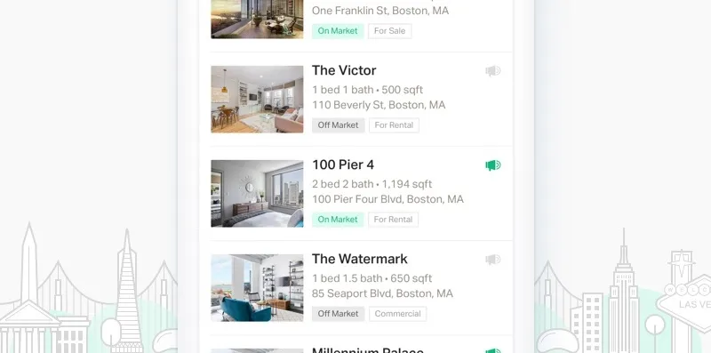
It consists of one element following another whether alphabetically, numerically or even randomly.
Item
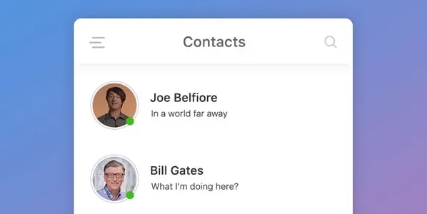
An item is an element of a list.
Card
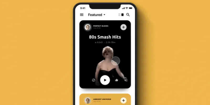
A card displays content in a manner similar to a playing card.
Navigation
Icons

Icons help to better communicate content, or can communicate and trigger a specific action.
Tabs
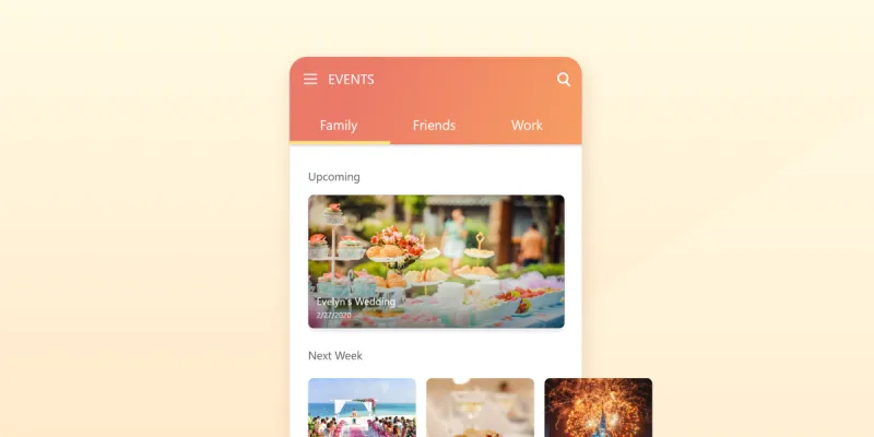
Tabs organize content across different screens, data sets, and other interactions.
Menu
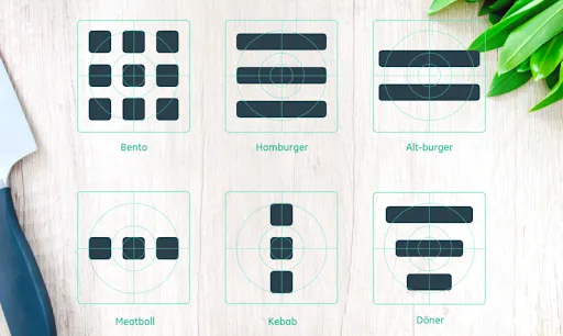
To navigate within your app, there are several types of menu: all of their names are food related.
Breadcrumb
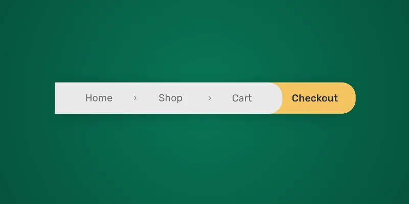
Breadcrumbs let users see their current location and show the hierarchy of content.
Progress bar
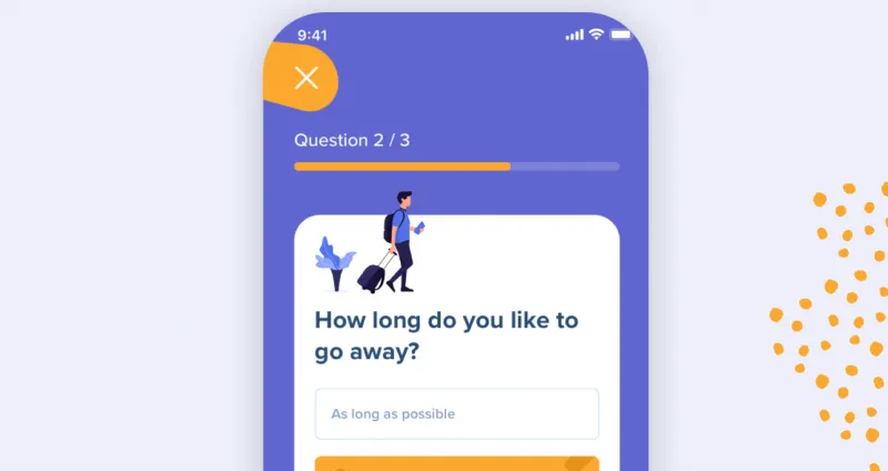
Progress bars help users visualize where they are in a series of steps.
Side bar
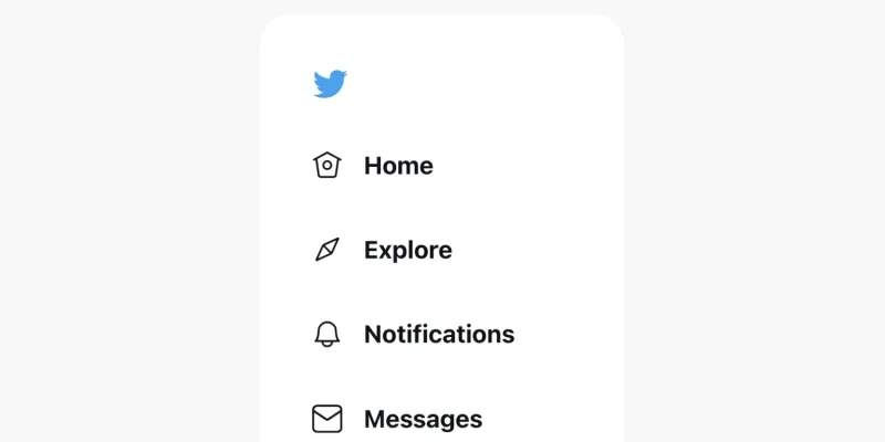
A sidebar displays a group of navigational actions or content literally on the side of a page.
Tab bar
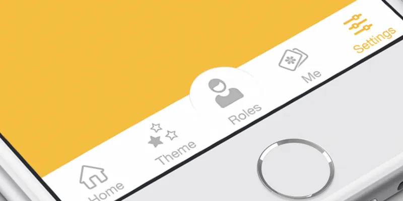
Tab bars appear at the bottom of a mobile app and allow users to quickly move back between the main sections of an app.


