Wed, Jan 27, 2016
Affordance: The Key to Creating an Intuitive Interface

A user interface is like a joke. If you have to explain it, it’s not that good.
If you are currently building an application, it’s important to test it with a child. The connection between a child and a mobile device is obvious and simple. Children never follow guidelines and they expect something to immediately happen. Therefore, there’s no better way for you to understand if your UI design is truly intuitive.
Several months ago, we tested an application with a group of children. The application included a “drag & drop” quiz where children had to create words by dragging the correct letters next to each other. However, during the session, the children tapped on the letters instead of dragging them, and they did not understand what they were supposed to do. This was likely because there were no clear instructions or clues provided.
If you really want to provide a relevant immersive experience, you need to carefully consider both design and interaction to make sure they will support each other in your storytelling. You can’t afford stopping the reading path by telling your users: “Hey ! Look at this pop up window, it tells you what to do!”
This is why you definitely need to consider affordance.
The Power of Affordance
Imagine you discover a new planet for the first time. You have to understand things you’ve never seen before using some clues about how each object can be used based.
It’s exactly the same when users open your application for the first time. You need to provide them with visual support so they’re actually not afraid of going further and they’re excited enough to follow their way.
Usually applied in web design, an “affordance” is best defined as those signals that indicate that an object may be used for a particular action or function.
For example, if you have a scrolling area, you expect to scroll, not tap it to go somewhere. We break paragraph blocks to make it clear there’s something more. This design lets you understand by yourself the action you need to do.

You should use affordance as a tool to make your designs easier to use and encourage users to undertake the actions you want. The better your use of affordance, the better the conversion rates will be. That is why using affordance is a key to a good interface design.
How to Apply Affordance to Mobile Design
Touch screens are providing many ways of telling stories and we are all requested everyday to understand those different ways in our mobile consultation. We sometimes feel exhausted by all these efforts. Haven’t you ever feel relieved by discovering an extremely simple application? This is the same with your users.
You need to carefully consider ergonomics, gestures, transitions and mobile-specific interaction patterns so that design provides an enjoyable experience.
The idea is to make interactions so intuitive and responsive in the same way a real object would. Animations play a very important role in maintaining that illusion for users and keeping them grounded in the UI. For examples, many apps for kids are using bounce buttons to draw attention.
That’s why PandaSuite will never lock you with technical constraints. While building your application, you need to think about your storytelling first. Make it simple. You just need to follow what is expected! 🙂
Examples of Affordance And Best Practices
- Back to previous example
We modified this screen and used the puzzle graphical representation to intend this idea of putting pieces together in a logical way. To do so, we applied a curved shape with a convex outer surface to the letters and we designed the dropping area with a concave inner surface.

- Switch buttons
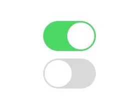
This iOS style switch button clearly implies you need to slide to on/off. However, you need to make it visually clear which direction is ‘on’. This can be done by lighting up an LED, by an icon on the display, changing colors, etc. It just needs to be very clear what state the machine is and that this button will toggle the state.

- Tap/Flick/Drag
Here are some affordance patterns found on touchscreen UIs:
- Unavailability
You can also show that features are not available at the moment. The most common negative signifier is grayed-out text or objects: it seems to fade into the background while the other elements are still really visible.
A Few Tips
- Once you define a principle, keep it all along your application. Otherwise users will be lost.
- Pay attention to physical objects in your everyday life.
- Navigate through many different apps, even in other sectors.
- Be careful of the way the user holds a device: it will influences how easy it will be possible to reach parts of the screen.
- Use metaphors, be more explicit, reveal what’s next only after an action.
